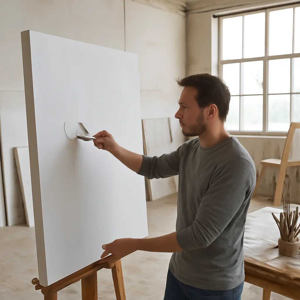
Canvas priming is the preparation of a fabric support with a ground that controls absorbency, texture, and paint adhesion. Advanced priming techniques change how canvas takes paint by adjusting those properties: sizing limits paint penetration, primer formulation sets the surface’s absorbency, and added layers or textures alter drag and brush response. The result matters in practice—oil paint can damage inadequately protected fibers, while highly absorbent grounds can pull binder from paint and leave colors looking dull. Understanding the options, their trade-offs, and safe application helps artists choose a surface for a specific medium rather than treating primer as a one-size-fits-all coating.
Canvas Priming Controls Absorbency, Texture, and Adhesion
Canvas priming is best understood as a layered system, not merely a coat of white paint. In conservation and materials practice, the support is commonly isolated with sizing, then coated with a ground that provides a paintable surface. The ground’s binder, pigment, thickness, and finish influence how quickly paint spreads, whether it sinks in, and how firmly it remains attached. These effects are especially important for oil painting, because oil can oxidize and degrade exposed plant fibers over time.
The National Gallery of Art describes traditional oil-painting preparation as involving a size and a ground; historically, glue size and chalk or lead-containing grounds were used, while modern artists often choose acrylic-based products. Modern materials are not interchangeable, however. A “universal” acrylic ground may be suitable beneath oil or acrylic paint when used as directed, whereas an acrylic dispersion ground should not automatically be treated as equivalent to traditional animal-glue size or as a guarantee of archival performance.
Sizing Separates the Fabric from the Ground
Sizing is a thin preparatory layer applied to canvas fibers to reduce penetration and provide a more stable boundary beneath the ground. Its purpose is distinct from priming: sizing conditions the support, while the ground creates the principal paint-receptive surface. Conservation guidance from the Canadian Conservation Institute emphasizes that canvas paintings are composite objects whose fabric, sizing, ground, and paint layers can respond differently to moisture, heat, and aging.
For oil painting, isolation is particularly consequential. Oil-rich paint in direct contact with untreated linen or cotton can contribute to fiber degradation. Acrylic dispersion products are often used as modern alternatives to traditional glue size, but their behavior differs, and manufacturers’ instructions matter. Artists should avoid assuming that any clear coating is a suitable size: a layer that is too slick, brittle, or incompatible can impair adhesion rather than improve it.
Ground Formulation Sets the Initial Paint Response
A ground is the coating that receives the paint. Commercial acrylic gesso typically contains an acrylic polymer binder and white pigment, commonly titanium dioxide, with mineral fillers that influence body and tooth. Despite its name, modern acrylic gesso is not the same material as traditional animal-glue-and-chalk gesso. The Smithsonian Museum Conservation Institute’s conservation work underscores the need to distinguish materials by composition and behavior, rather than relying on shared labels.
A relatively absorbent ground tends to draw liquid vehicle into its surface, making paint feel less slippery and potentially dulling its appearance. A less absorbent, smoother ground can allow paint to move and blend for longer. These are tendencies, not fixed outcomes: paint formulation, brushwork, layer thickness, and drying conditions also affect the result. A small test panel is more reliable than judging a ground by its label alone.
Advanced Canvas Priming Methods Modify Paint Handling
Once the support and ground are understood, artists can tune the surface through controlled changes in dilution, layering, abrasion, and texture. These methods are useful when a standard factory-primed canvas feels too absorbent, too slick, or too uniform. The key is to modify the surface in ways that remain compatible with the intended paint medium and to test the complete layer sequence before committing to a finished work.
Thin, Multiple Coats Create a More Even Ground
Applying several thin coats rather than one heavy coat can reduce ridges and help produce a more consistent surface. Allow each coat to dry as directed, and change the direction of application between coats if a more uniform finish is desired. A thick coat may bridge the weave, obscure canvas texture, or dry unevenly; thin coats give the artist more control over how much texture remains visible.
The number of coats should not be treated as a universal formula. Canvas weave, primer brand, desired texture, and intended medium all matter. For oil painting, follow the ground manufacturer’s stated suitability for oil and its required application instructions. The Canadian Conservation Institute’s guidance on canvas paintings is a useful reminder that layered works can fail at interfaces, so compatibility and sound application are as important as the surface’s immediate feel.
Controlled Sanding Changes Tooth and Drag
Light sanding between fully dry coats can reduce brush marks and create a smoother surface, while leaving the final coat unsanded preserves more tooth. “Tooth” describes the microscopic texture that helps paint make contact with a surface. A smoother ground can support fine detail and fluid blending; a toothier ground can offer more resistance for drybrush effects and visible brushwork.
Sanding should be conservative. Removing too much ground can expose the sizing or fabric and create uneven absorbency. Use appropriate dust protection and avoid dry sanding materials unless the product’s safety guidance permits it. Artists working with historic or unknown coatings should not sand them casually, because older grounds may contain hazardous materials.
Absorbent Grounds Increase Sink-In and Matte Effects
An absorbent ground is designed to take up more liquid from paint, encouraging a matte appearance and a quick, less slippery feel. This can suit underpainting, watercolor-like acrylic effects, or techniques in which rapid setting is useful. The trade-off is that strong absorption may pull binder away from the pigment-rich surface layer, making color look flatter or less saturated.
A practical example is an acrylic painter who wants washes to settle into the ground rather than bead or remain glossy. An absorbent product can help, but the artist should test whether successive layers remain well bound and whether the finished surface suits the intended varnish or display conditions. A ground’s absorbency is a handling characteristic, not by itself a measure of long-term durability.
Slicker Grounds Support Blending and Glazing
A relatively smooth, less absorbent ground allows paint to travel farther before setting into the surface. Artists may prefer this for blending, glazing, fine lines, and controlled transitions. If the surface is excessively slick, however, paint may have difficulty gripping, especially in thin passages. The goal is a balance: enough movement for the technique, but sufficient surface texture and compatibility for dependable adhesion.
Artists can compare a standard acrylic ground with a smoother product on adjacent test panels, using the same paint and brush. Record whether the paint beads, drags, levels, or dries unevenly. This simple comparison reveals more about real-world handling than product descriptions alone.
Texture Additions and Specialized Grounds Expand the Options
Priming can also shape the visible relief of a painting. Artists may build texture into the ground, preserve the weave, or choose specialized grounds intended for particular media. These choices affect not only appearance but also how paint catches on raised areas, settles into valleys, and behaves under repeated brushwork.
Textured Grounds Create a Deliberate Surface Profile
A textured ground contains or is applied with materials that create raised marks, grooves, or an irregular tooth. Artists can build texture with a brush, palette knife, or compatible modeling medium, then allow it to dry fully before painting. Raised areas catch light and paint differently from recessed areas, making texture part of the composition rather than an accidental feature of the fabric.
Texture should be proportional to the canvas and paint layer. Very high ridges may be vulnerable to impact or cracking, especially if the ground is applied too thickly or the support flexes. For an example, a landscape painter might use a restrained textured ground to catch drybrush highlights on foliage, while a portrait painter may prefer a smoother surface for gradual transitions.
Oil Grounds and Acrylic Grounds Are Not Interchangeable by Default
An oil ground uses an oil-based binder and is formulated to receive oil paint; an acrylic dispersion ground uses a water-based polymer binder and is often marketed for multiple media. The two can feel and age differently. Oil grounds may provide a less absorbent painting surface, while acrylic grounds can be convenient and fast-drying, but product specifications determine appropriate use.
The National Gallery of Art’s historical discussion of painting materials helps explain why “gesso” can refer to substantially different recipes across periods. Follow the manufacturer’s directions for drying time, layer thickness, and compatible paint. In particular, do not place oil paint over an acrylic layer that has not dried or cured as directed, and do not assume an oil ground is suitable beneath acrylic paint.
Colored Grounds Influence Value and Color Judgments
A toned ground is a colored preparation layer that establishes a starting value or hue. A middle-value ground can make it easier to compare lights and darks than working against bright white, while a warm or cool tone can influence how adjacent colors appear. The effect is perceptual as well as practical: the ground remains visible in gaps, thin passages, and scumbled areas.
Artists can create a toned surface with a compatible pre-tinted ground or a thin, well-tested layer of paint over a fully prepared surface. The choice should account for the medium and the paint layers that follow. A quick study on a toned panel can show whether the color improves value decisions or shifts the finished palette in an unwanted direction.
A Test-Panel Workflow Makes Priming Decisions Measurable
Priming effects are easiest to compare when variables are controlled. Prepare small panels from the same canvas or use comparable supports, then change one feature at a time: ground type, number of coats, sanding, or added texture. Keep paint, brush, dilution, and drying conditions as consistent as possible. This turns subjective impressions into observations that can guide later work.
- Label each panel with the support, sizing or ground product, coat count, and any sanding or texture treatment.
- Apply the same paint passage to each sample, such as a wash, opaque stroke, glaze, and drybrush mark.
- Record spreading, drag, beading, sink-in, drying appearance, and ease of lifting or blending.
- Inspect the dry samples under consistent lighting, then retain them as a reference for future paintings.
A comparison chart can track surface type against four outcomes: absorbency, brush drag, visible texture, and paint movement. This is more useful than ranking grounds as simply “good” or “bad,” because the best surface depends on the technique. For example, an absorbent ground may be excellent for a quick matte underpainting but frustrating for long, fluid blends.
Conclusion: Match Canvas Priming to the Paint Technique
Canvas priming changes paint handling by controlling the relationship between fabric, sizing, and ground. Sizing helps isolate fibers; ground formulation sets absorbency and adhesion; sanding and layered coats adjust tooth; and textured or colored grounds add further control over surface and composition. These properties explain why the same paint can feel dramatically different on two canvases.
The broader lesson is to select preparation for the medium and technique, not simply for a product label. Use manufacturer guidance, make test panels, and document results. For more context, consult conservation resources from the National Gallery of Art and the Canadian Conservation Institute, especially when working with valuable or historic materials.
Sources: National Gallery of Art, “The Materials and Techniques of European Paintings,” https://www.nga.gov/research/publications/pdf-library/materials-and-techniques-european-paintings.html; Canadian Conservation Institute, “Canadian Conservation Institute Notes 10/3: Canvas Paintings—Their History and Conservation,” https://www.canada.ca/en/conservation-institute/services/conservation-preservation-publications/canadian-conservation-institute-notes/canvas-paintings-history-conservation.html; Smithsonian Museum Conservation Institute, “Museum Conservation Institute,” https://mci.si.edu/